An opportunity was identified for NEFCU to reposition itself on a platform of Brighter Banking and recast itself as an organization that helps its members lead life with optimism, convenience and energy. The positioning was articulated through a corporate narrative, messaging platform and a new, fresh brand voice.
The new positioning called for a new name. The credit union has ambitions to expand its service area beyond Nassau County and attract younger members. After a long collaborative process with the executive team and the board, the name “Jovia” was selected. Stemming from the root word jovial, Jovia embodies the optimism, friendliness and energy that the organization wants to be known for.
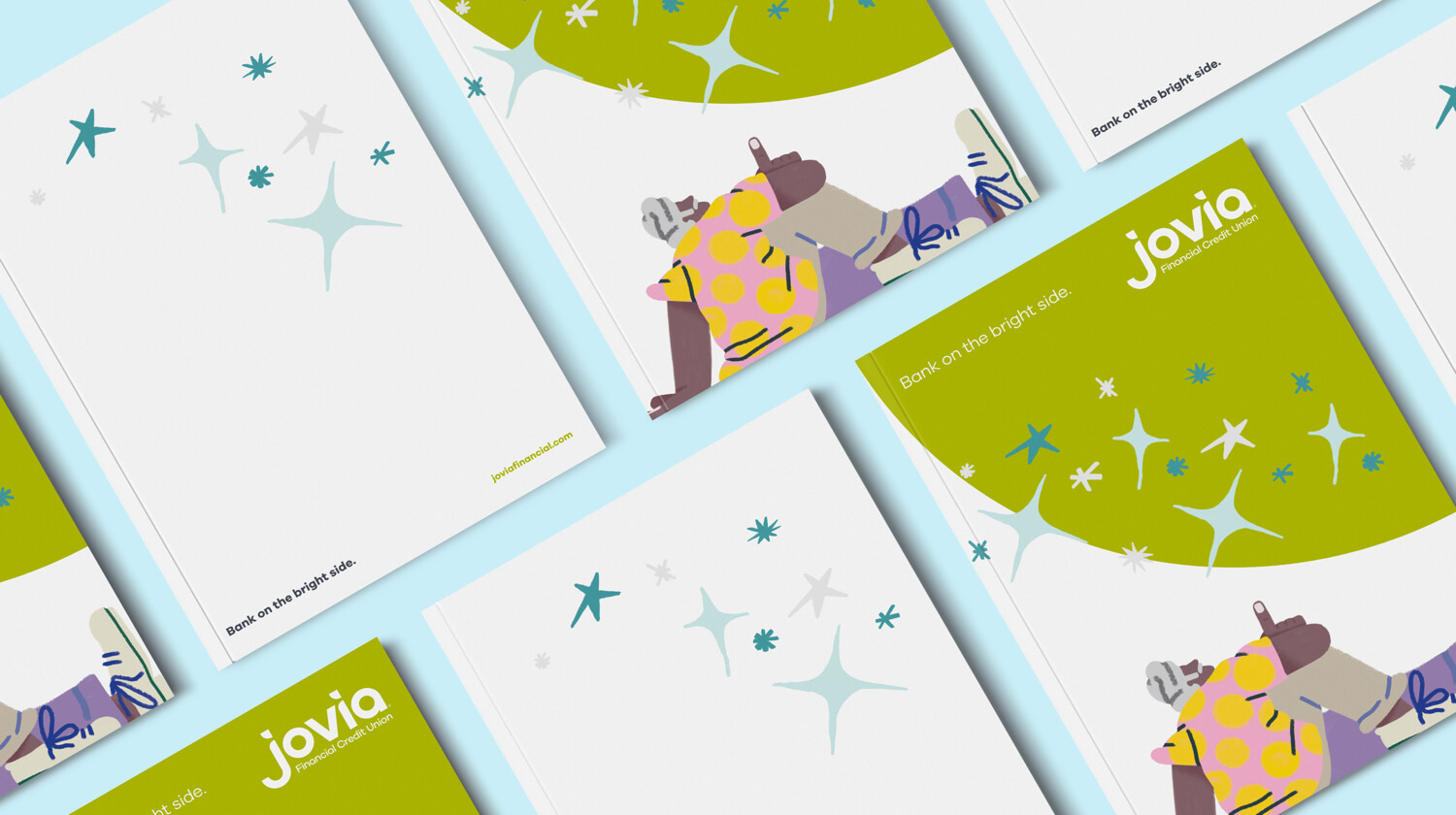
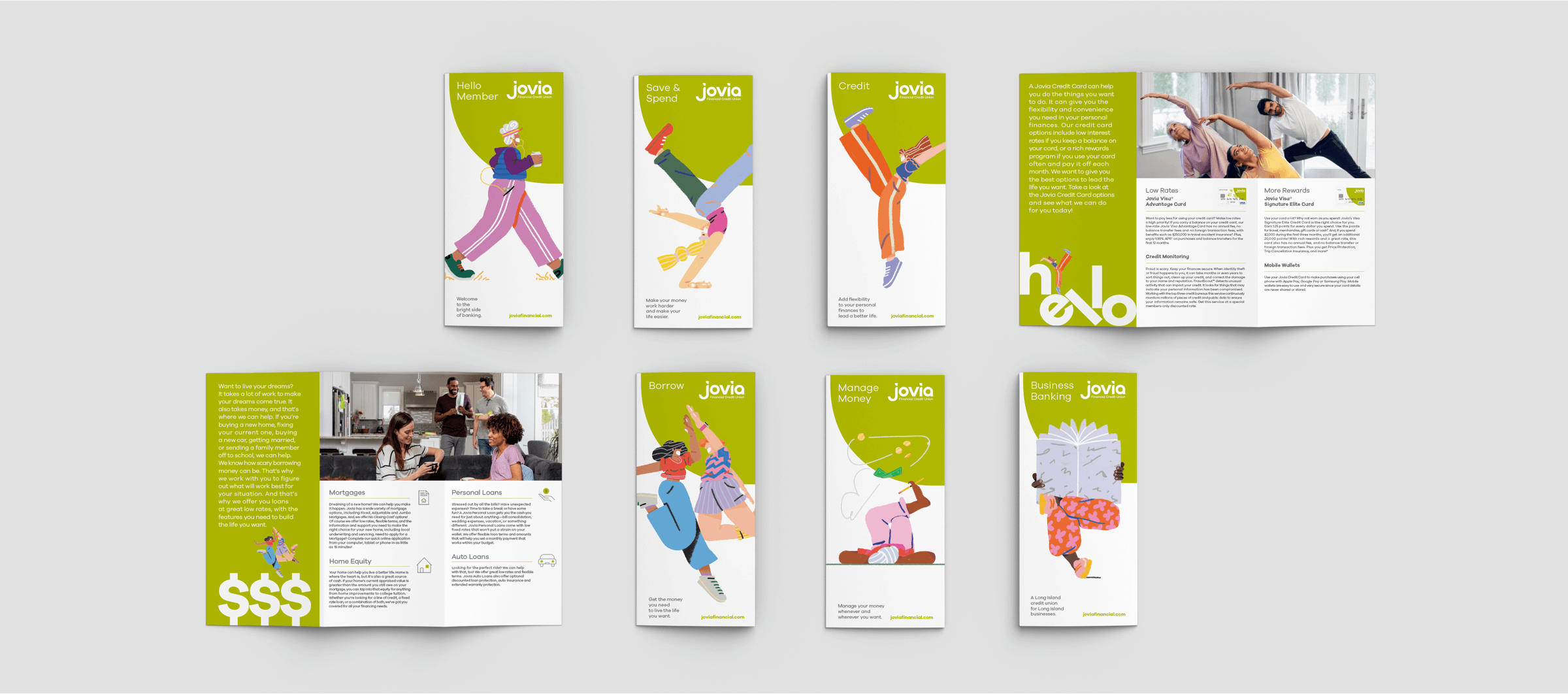
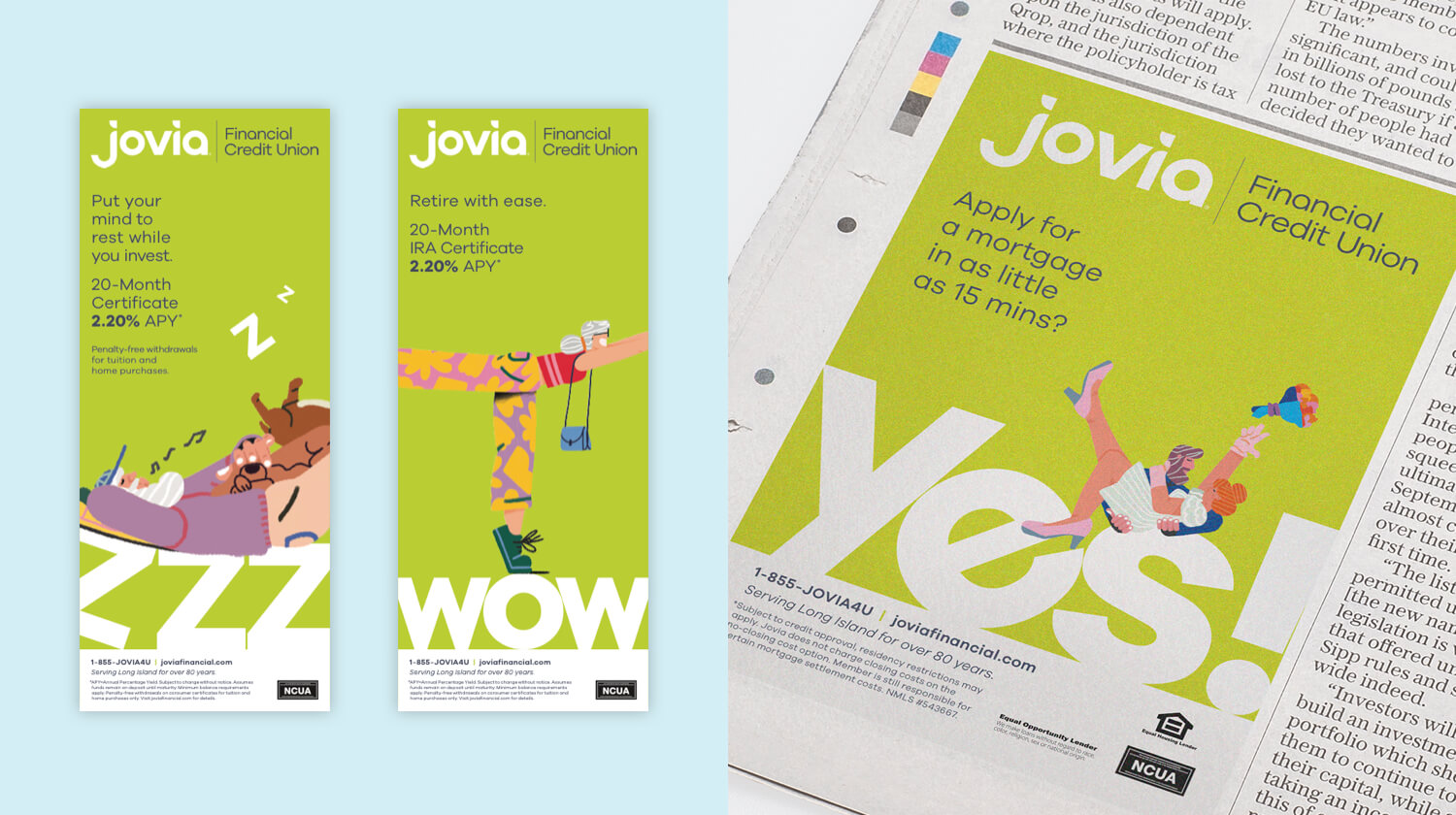
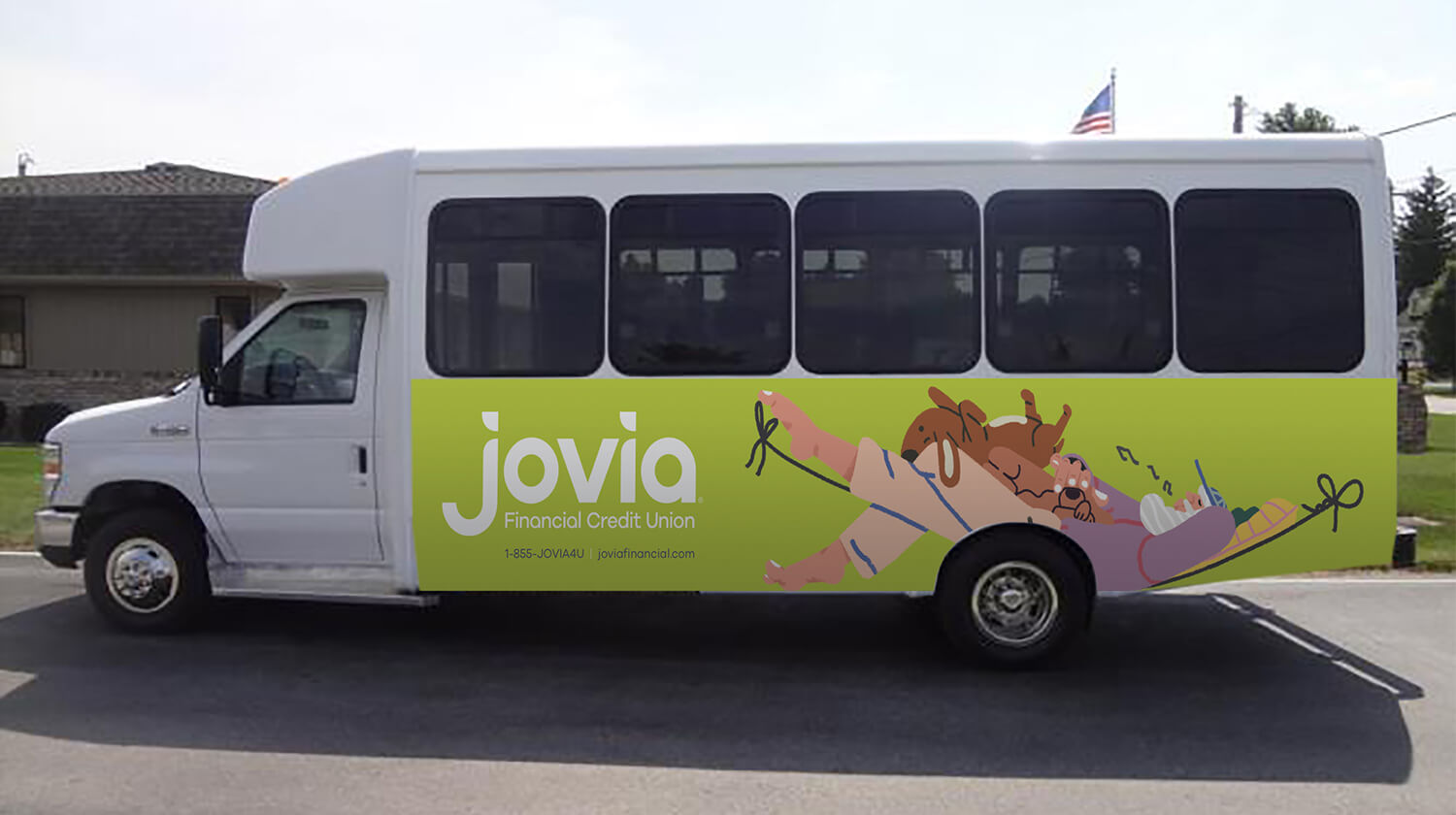
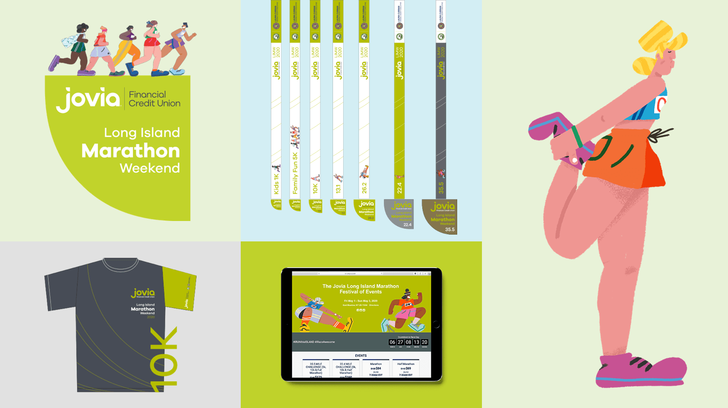
A new, unique and distinctive visual language was developed to break the perceptions of credit unions generally as rigid, conservative and lacking innovation. A bright, distinctive brand color was chosen for Jovia to stand out in crowded mall environments and busy commercial roads. A playful illustration-based language was also created and comprehensively deployed to enhance emotional power and human connection in a competitive field dominated by generic, corporate financial brands.
A complete redesign of the total member experience underpinned and supported the entire brand strategy. It led to simplification of processes and the rethinking of the interaction between members and the organization. The branch experience was also completely redefined to create an optimistic and open environment.
A new, invigorated culture was built on purpose, vision, mission and value statements. All employees were trained prior to the launch to ensure they had both the emotional connection to the brand as well as an intellectual understanding of its intent.
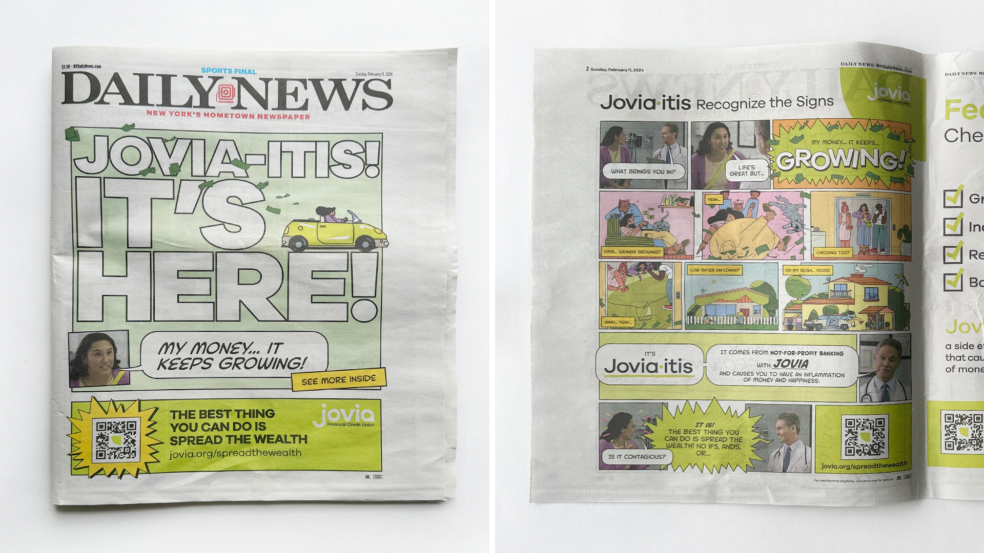
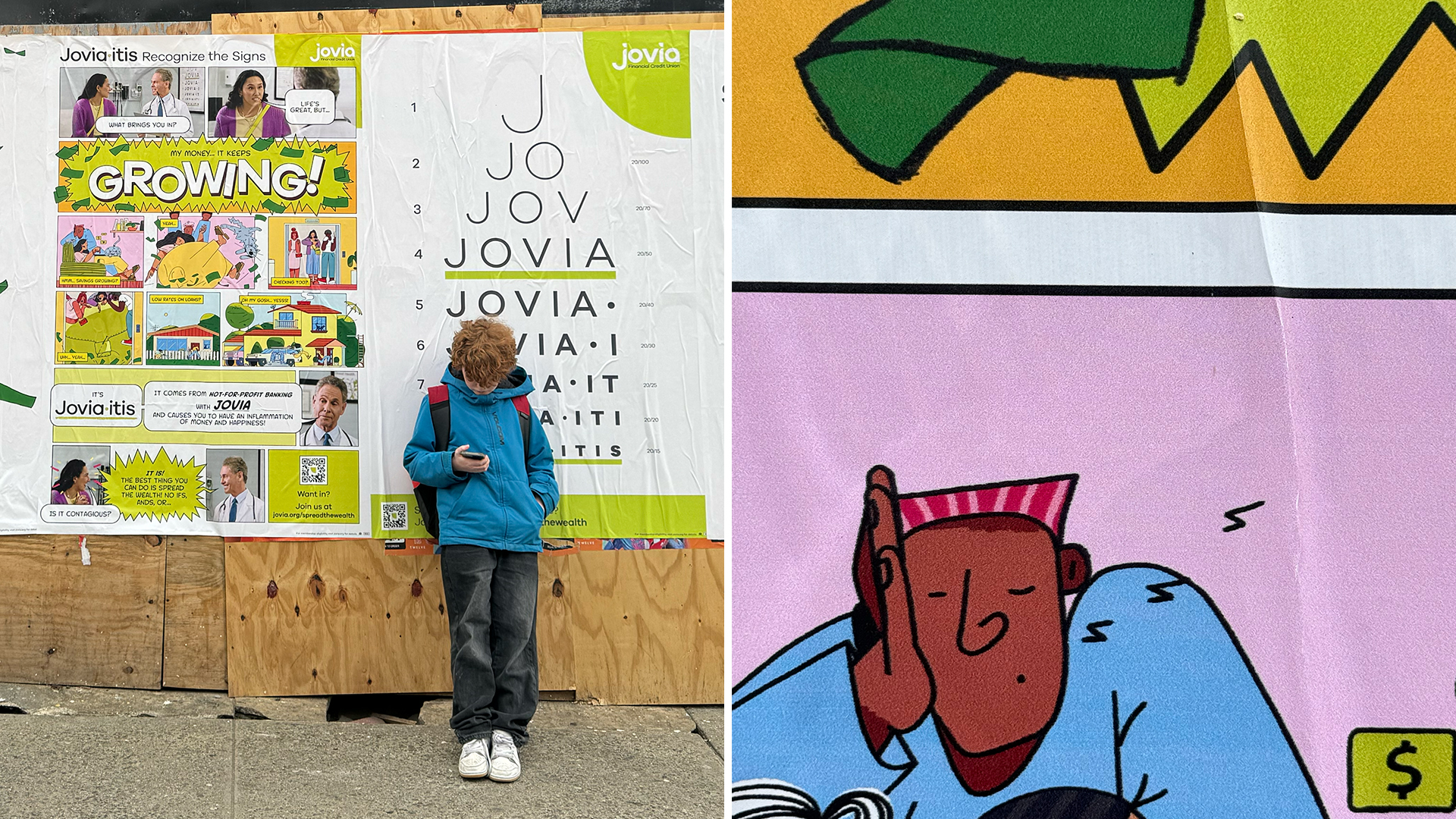
The brand was launched to the market through an integrated communications plan that included TV, radio, digital, out-of-home, cinema, advertising as well as direct marketing.