Rosas & Xocolate | Authentic Luxury

SCOPE
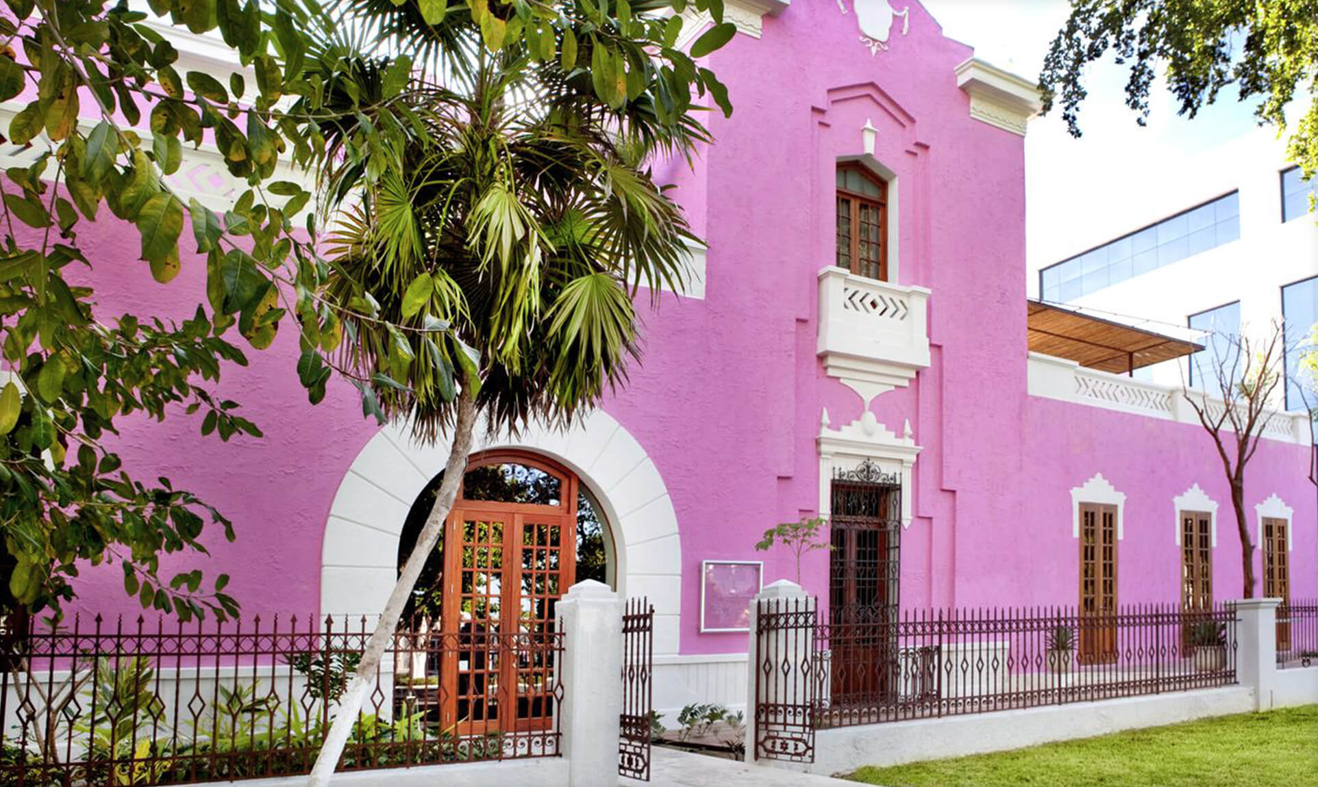
We started with a man, a dream, a broken-down old building and a rich history.
BRAND
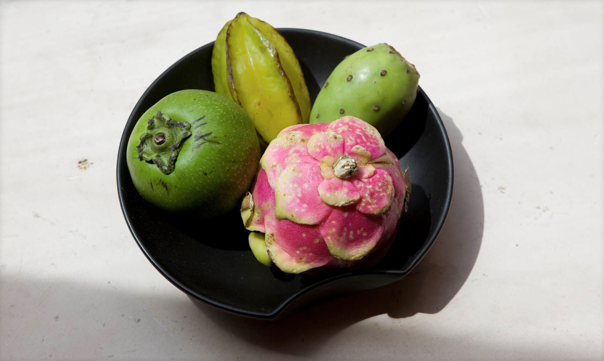
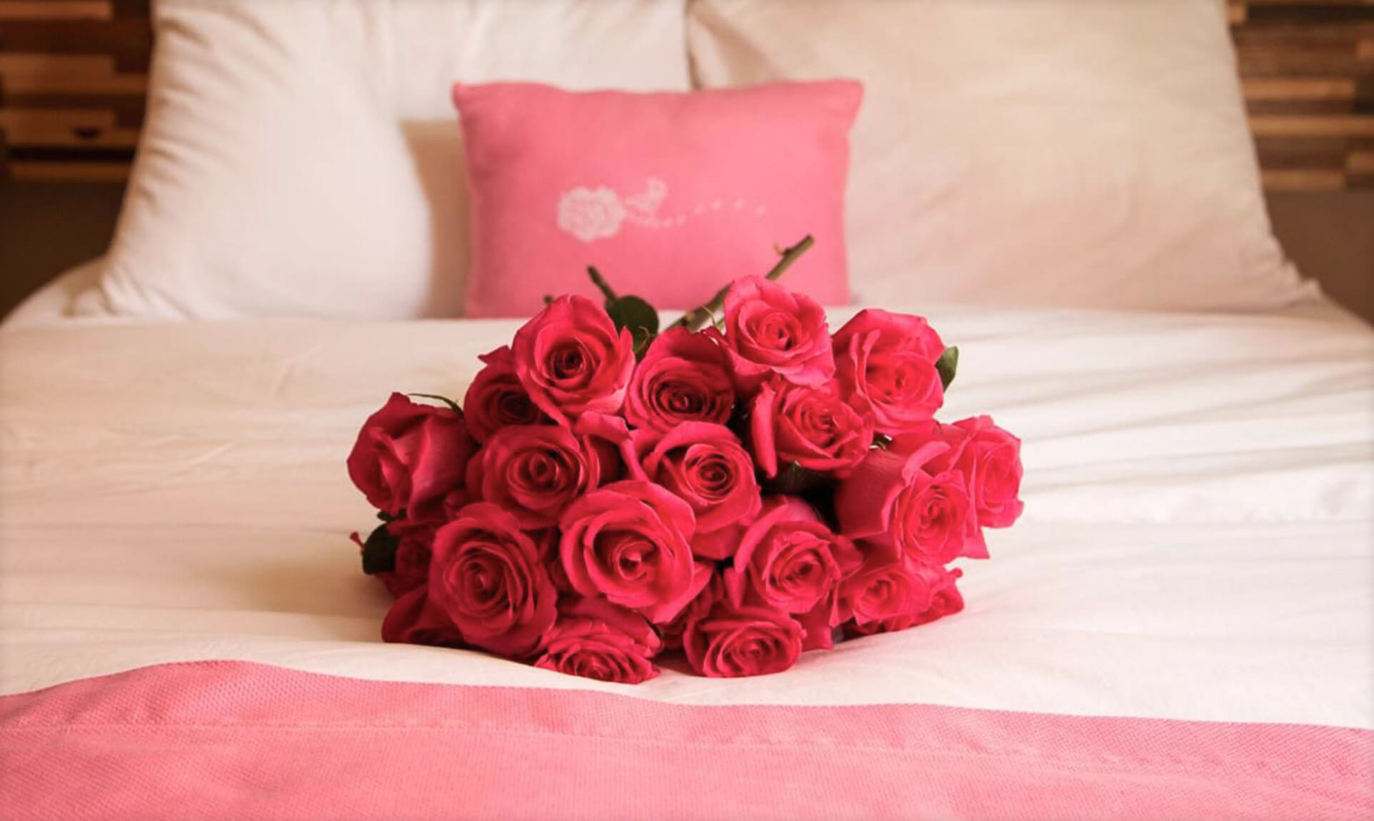
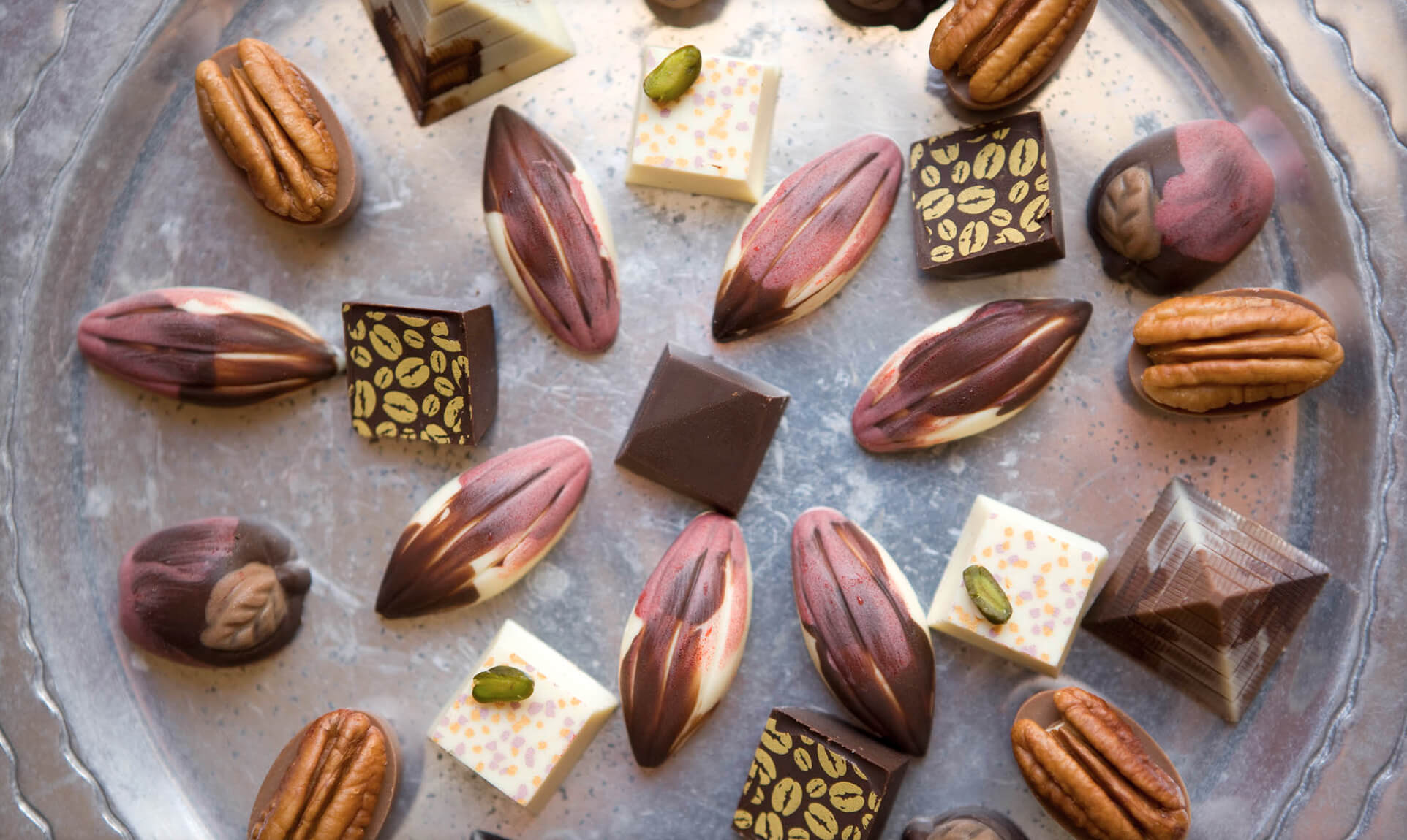
Roses and chocolate represent the spirit of romance itself. We combined this concept with the rich history of the Yucatan to capture the spirit of this resort and spa.
POSITIONING
Since Rosas & Xocolate is a high-end resort and member of the Design Hotels Group, we knew we were speaking to a design-conscious audience. We also knew that Carroll (the owner) wanted the hotel to feel native to Merida, Mexico. Our design strategy was to combine refined typography and high design with folk art and patterns from Merida and the Mayan culture.
Strategy
- Cultural Insight – Qualitative Research
- Brand Positioning
- Tagline
- Corporate Narrative & Messaging
- Digital Strategy
- User Experience Mapping and Analysis
Design
- Logos & Visual Systems
- Brand-based Marketing Systems
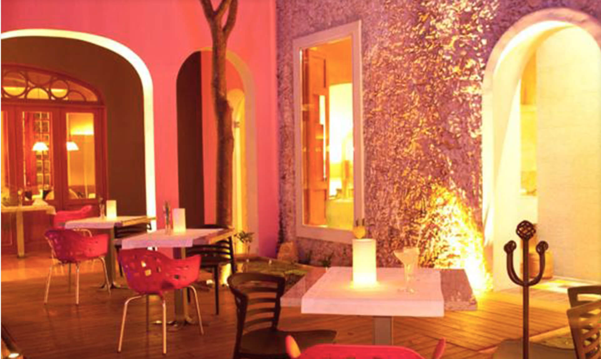
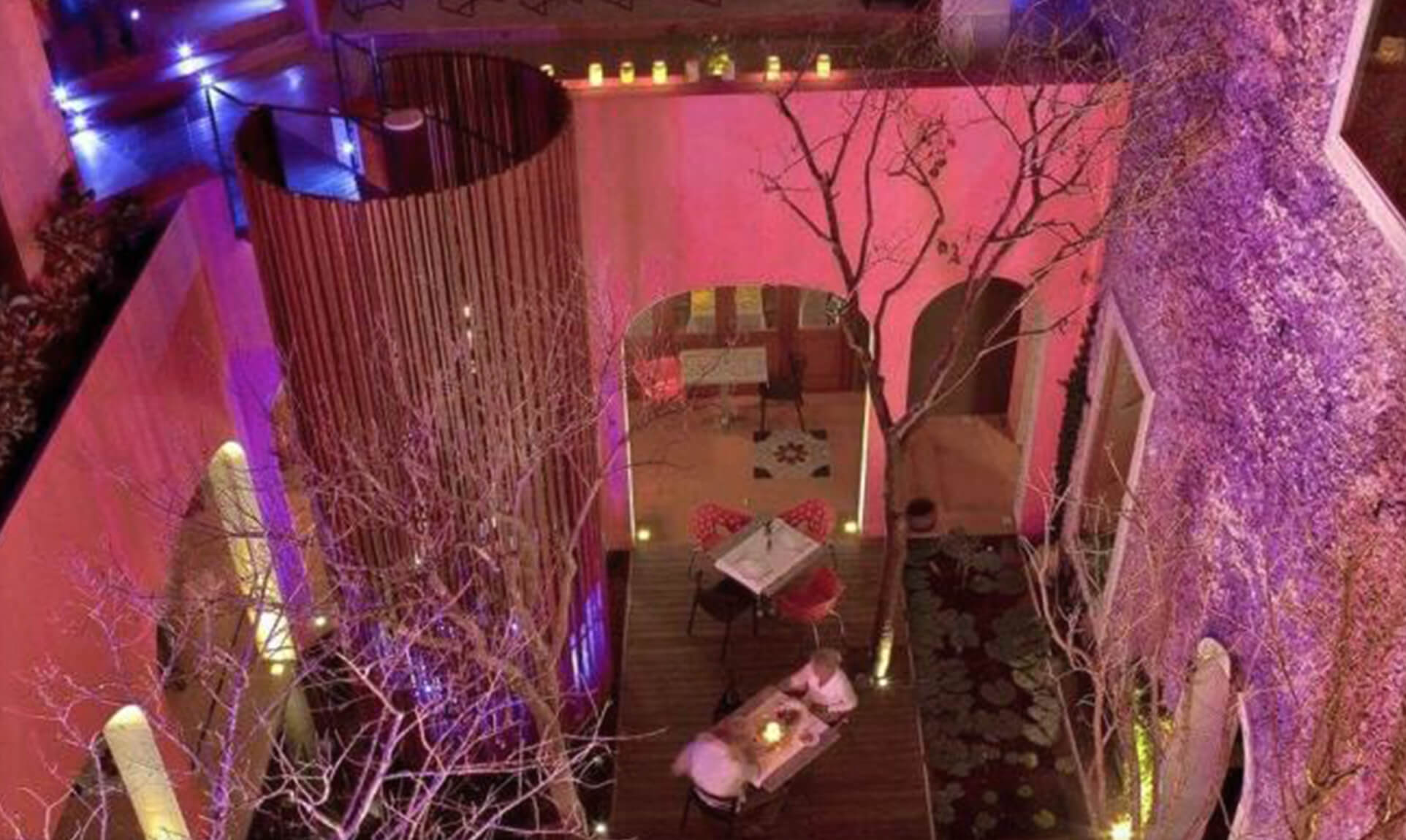
- Environmental Branding:
– Hotel
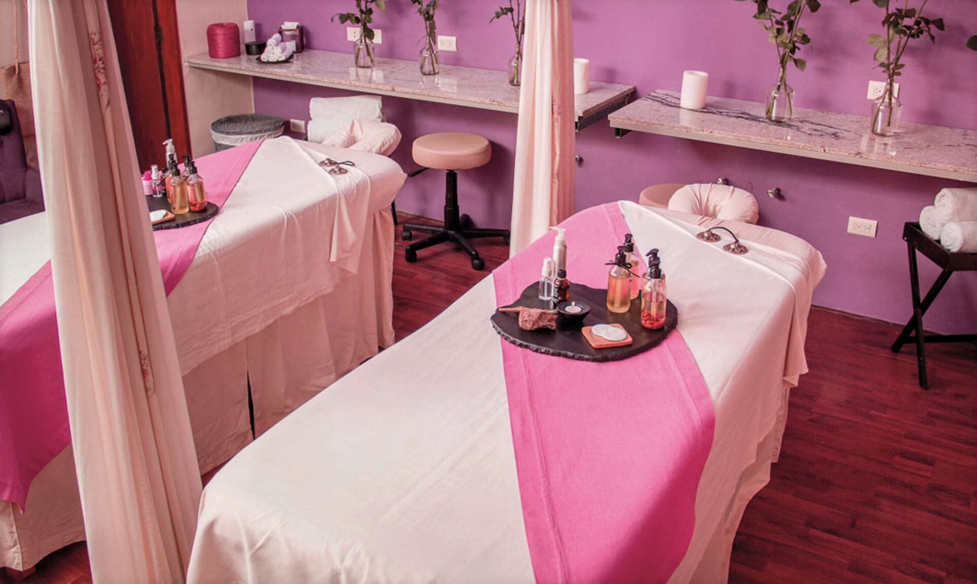
– Spa
– Restaurant
– Chocolate Store - Accessories and Amenities
- Chocolates and Packaging
- User Experience
- Website Design
- Way Finding Systems
Activation
- Launch Planning
- Digital & Website Maintenance
- Signage
- Store Design
STRATEGY
- Cultural Insight – Qualitative Research
- Brand Positioning
- Tagline
- Corporate Narrative & Messaging
- Digital Strategy
- User Experience Mapping and Analysis
DESIGNACTIVATION
- Logos & Visual Systems
- Brand-based Marketing Systems
- Environmental Branding:
– Hotel
– Spa
– Restaurant
– Chocolate Store - Accessories and Amenities
- Chocolates and Packaging
- User Experience
- Website Design
- Way Finding Systems
ACTIVATION
- Launch Planning
- Digital & Website Maintenance
- Signage
- Store Design

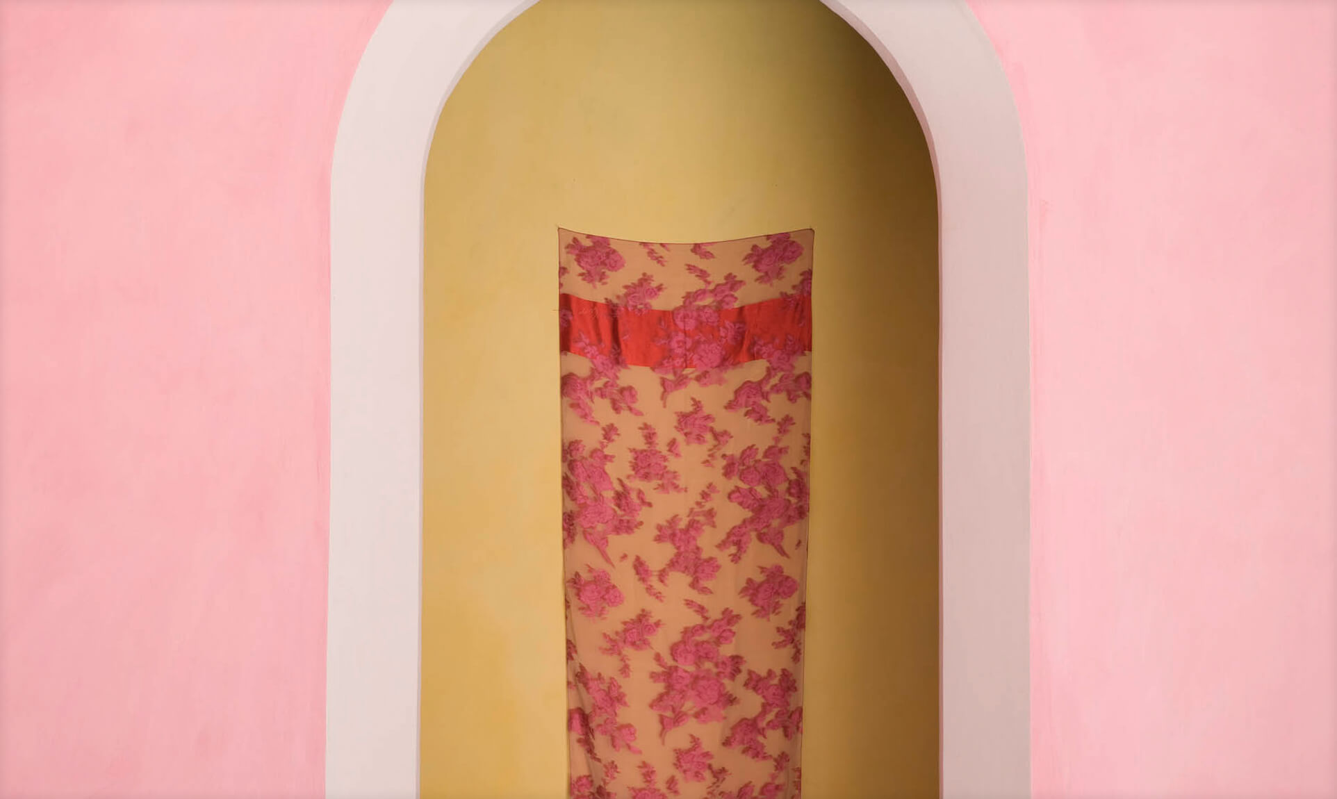
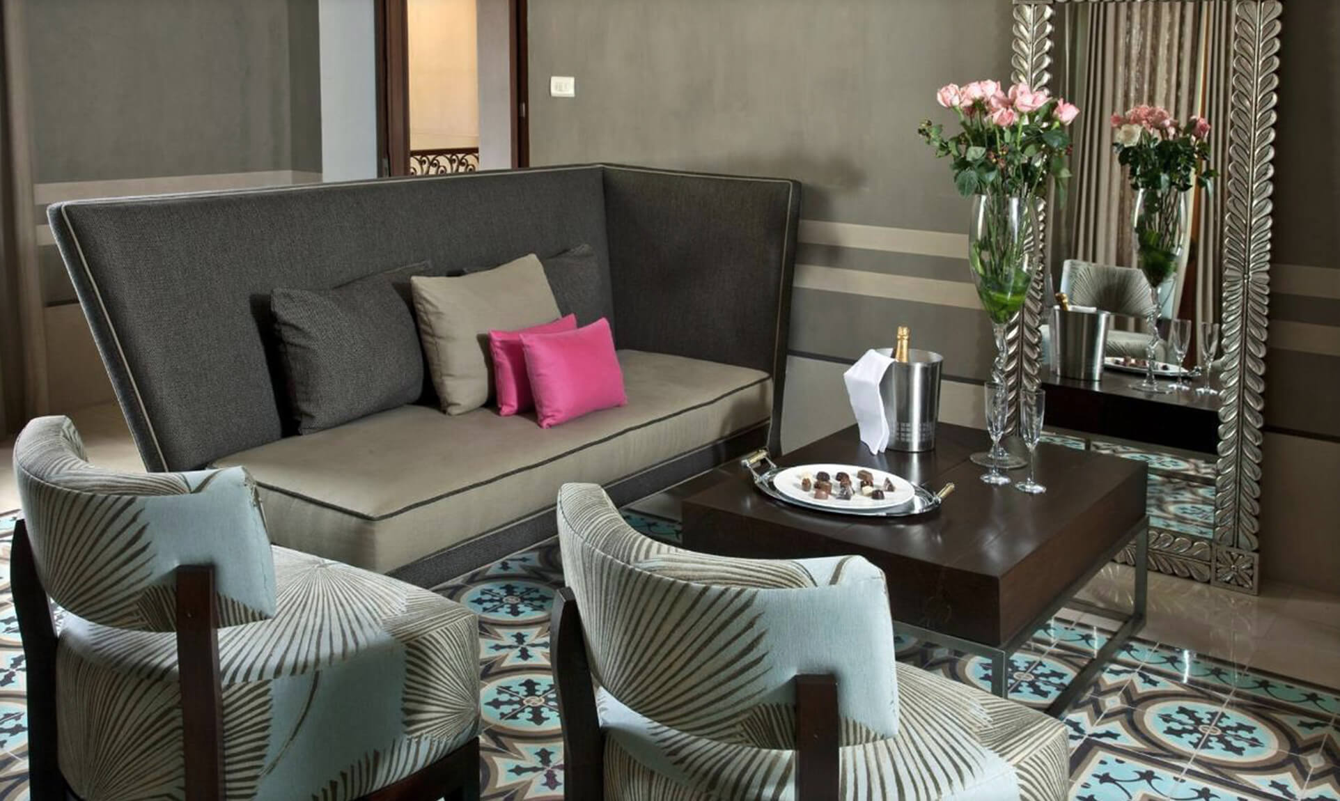
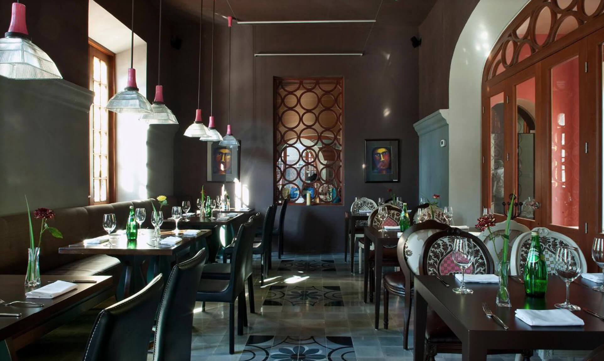


The pattern, which is used throughout the identity, is based on the locally crafted floor tiles that were rescued and restored from the original buildings. We created simple printable menu sheets and letterhead for the restaurant and bar.


Challenge
- old buildings that were at the end of demolition and at the very beginning of restoration
- dirt floors
- a 12’ X 18’ cinderblock building in the middle of a construction site that was decorated in the manner of a finished room
- architectural renderings
On top of this, we needed to accelerate the visual identity process, as we had a fast-approaching deadline for branded materials due to Design Hotels for their catalogue and website.
Strategy
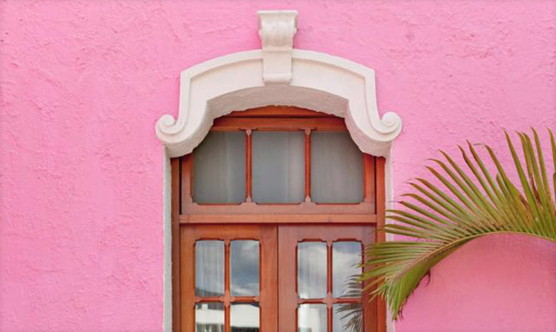
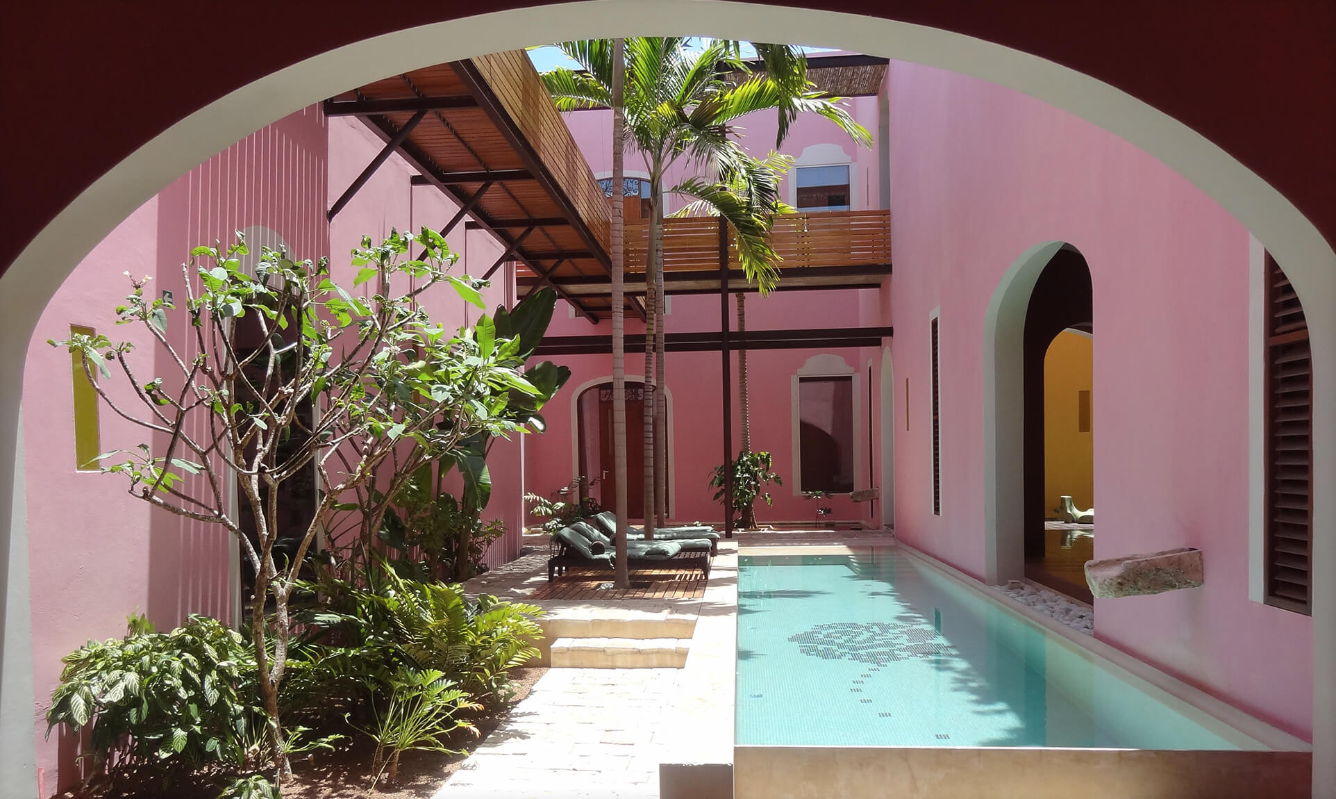
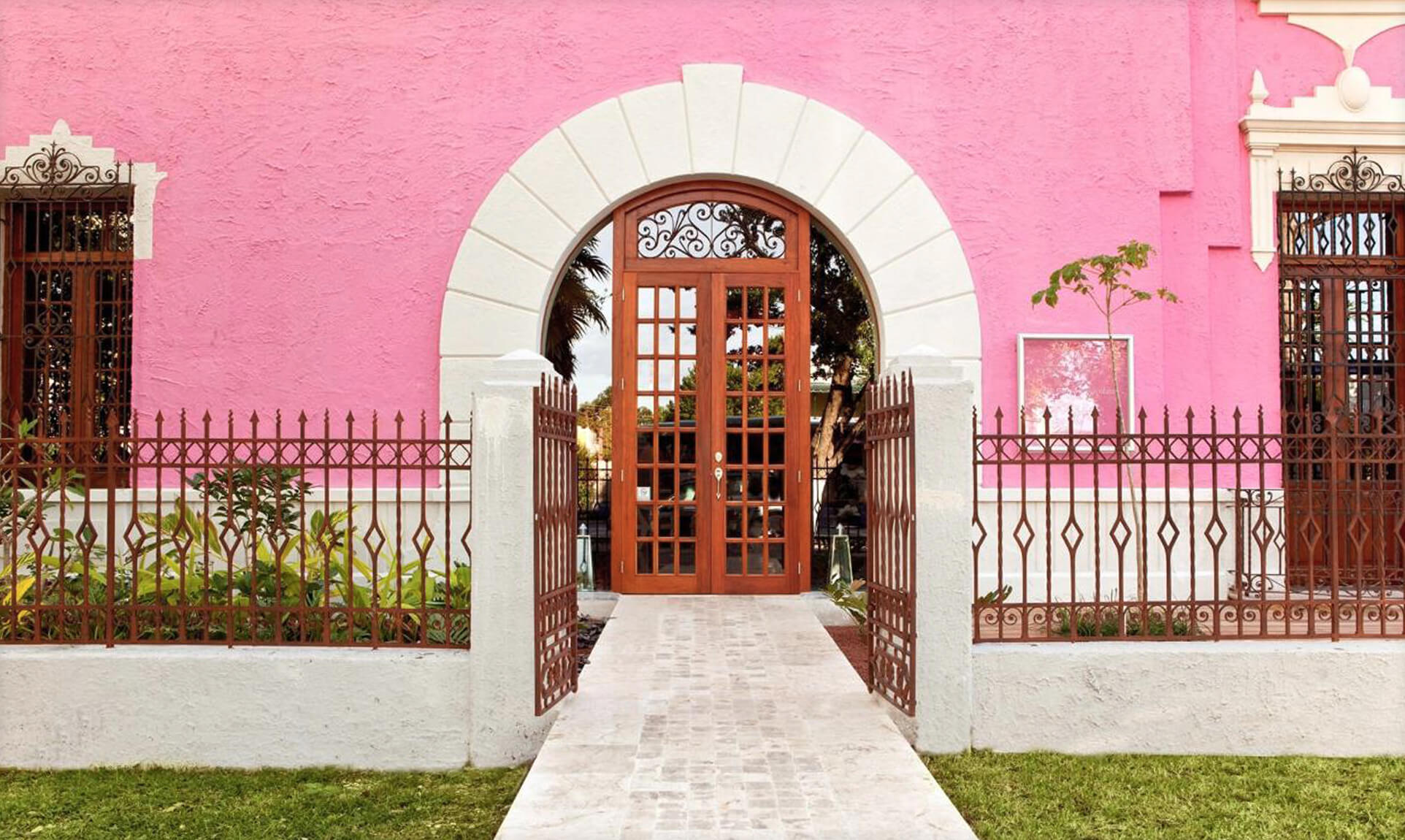
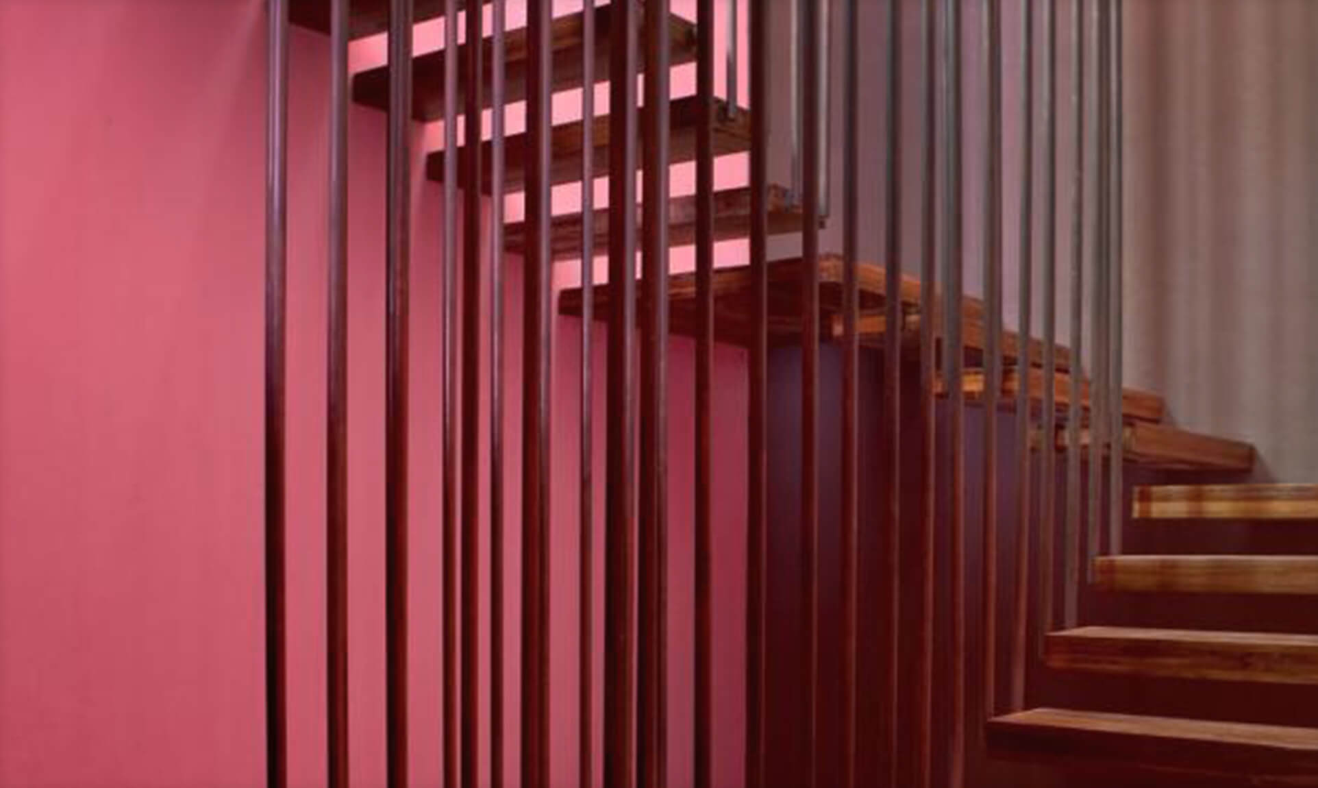
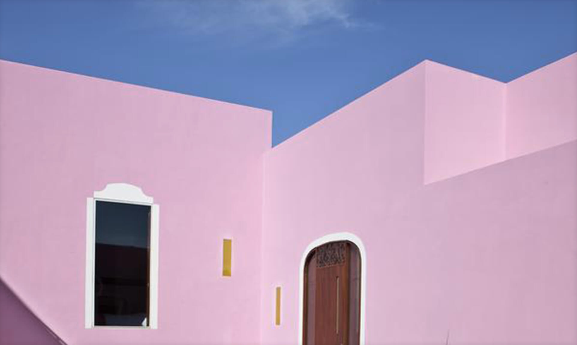
We worked closely with the world-renowned Reyes Rios + Larrain Studio of Architecture, who helped us not only understand the design of the future hotel but schooled us on the materials and the traditional building techniques they were using. We collaborated on the color palette for the architecture of the buildings and used this as the basis of our branded color system.
Since Rosas & Xocolate is a high-end resort and member of the Design Hotels Group, we knew we were speaking to a design-conscious audience. We also knew that Carroll (the owner) wanted the hotel to feel native to Merida, Mexico. Our design strategy was to combine refined typography and high design with folk art and patterns from Merida and the Mayan culture.
Although it is a premium resort, the fact remains that it is an individually owned, Mexican start-up with limited funds. We needed to build a deep brand system that can be reproduced inexpensively with room for continuous expansion.
Outcome
We met the deadline for Design Hotels, and we launched the website and hotel on time. The brand is now expanding into products.
“You guys were the only partners who came through on everything you said you would do. The brand strategy is integral to every decision we make.” Carol Fischer


