Citizen Stock | Fake People Suck
SCOPE
Capturing the essence of a business strategy to build a brand.
BRAND
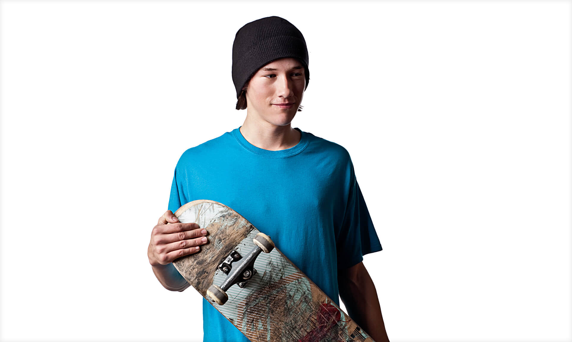
Citizen Stock was launched to meet the underserved need of the market for fresh, new stock photography images featuring real people. The models are not models at all, but children, moms, dads, grandparents, skateboarders, lawyers, teachers, musicians, chefs, artists, office workers, clothing designers, shop clerks and small business owners, to name a few.
POSITIONING
OTTO Brand Lab first developed a brand identity that captured the universal spirit of portraiture in a single word: “Smile!” The most fundamental word in photographic portraiture became the foundation for the Citizen Stock brand.
Strategy
- Brand Positioning
- Tagline
- Corporate Narrative & Messaging
- Digital Strategy
- User Experience Mapping and Analysis
Design
- Logos & Visual Systems
- Video & Brand Animations
- Brand Voice
- Content Strategy
- UX, UI
- Website Design
ACTIVATION
- Launch Planning
- Brand Campaigns
- Digital Marketing & Website Maintenance


Building upon the graphic “Smile” from the logo we created a clean utilitarian system that captured the brand with honesty and clean powerful style we call utilitarian awesomeness.

Authenticity forms the foundation for the Citizen Stock brand pillars that guide all decisions related to brand and customer interaction.

Our process for design decision making broke down to three steps: 1) being inline with the brand pillars focus on function first 2.) finding a simple, fool-proof repeatable way to create the same quality branded materials in-house, again and again, no matter who is doing it. 3.) Utilitarian Awesomeness—simplifying it to its core and turn it up!

Imagery was the fuel for our marketing engine, which included a website that needed to be refreshed weekly with images, not to mention digital marketing and daily social outreach. Editing was a constant activity. Thankfully, Sheri Nicole and David Katzenstein provided a constant flow of amazing, one-of-a-kind humans captured as they are.
Black, white and gray are the colors of the utilitarian, everyman, Citizen brand. White space is used to create simplicity and ease of use as well as drama. Each feature works in a simple, user-tested, common-sense manner.
In all of our interactions, we looked to simplify all experiences based on user needs. From this position, we created killer features such as drag and drop light boxes, automatic PDF creation and common language word search.

To promote the Citizen site, we needed a concept that was on-brand and got people to engage with our communication. The “Fake People Suck” positioning provided us with a tagline that did just that. It is spot on from a strategy perspective. Hard to forget, as our open rate demonstrates—and is fundamentally true.
All of our promotions use the concept of “key word search” to highlight the “real” people featured on the site. By combining unique combinations of attributes, you get unexpected results. Our push-emails feature three search words in each headline that describe the image. Creating new search terms (headlines) for Sheri’s images was a weekly challenge. Figuring out that little twist was a treat.

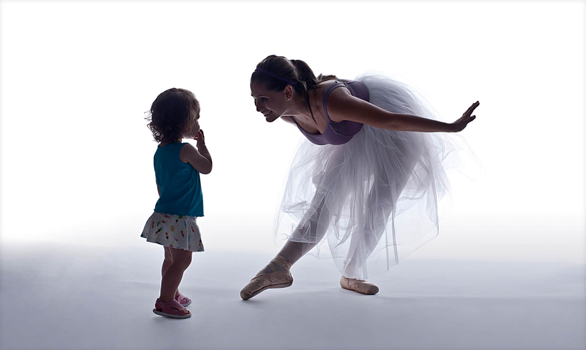
OTTO Brand Lab helped edit and package special image collections such as Silhouettes, Motion and various themed packages such as Teenage Angst.
Challenge
Their challenge to us was clear and direct—develop an authentic, disruptive brand that reflected and supported our business strategy as the first stock photo agency devoted to portraiture of “real people“. We took them at their word.
Strategy
Citizen Stock was launched as a source of fresh, new Rights Managed and Royalty Free stock photography images featuring real people. The models aren’t models at all, but children, moms, dads, grandparents, skateboarders, lawyers, teachers, musicians, chefs, artists, office workers, clothing designers, shop clerks and small business owners, to name a few.
OTTO Brand Lab first developed a brand identity that captured the universal spirit of portraiture in a single word: “Smile!” A smile is one of the most basic human universal responses. It says with pleasure and happiness. It transcends race, class, age, sex and borders. The most fundamental word in photographic portraiture became the foundation for the Citizen Stock brand.
Outcome
Again, building on the company’s business concept, an innovative promotional strategy was built around the idea of search terms that would be unique to Citizen Stock—real, better, proud, artistic, consistent, original, human, honest—emphasized the authentic quality of the brand and the uncompromising “realness” of the portraits.
Website
For a stock photography business, the Citizen Stock website was naturally a primary brand channel. Users are partners. The commitment of the company’s founders to photography as an art was the driving idea for the site. We put portraits at the center of the site itself. The intuitive experience we built around this ethos became a true manifestation of the Citizen Stock brand.
To promote the new website, we created a complete social media campaign utilizing push-emails, Twitter, Facebook and press coverage to raise awareness and drive traffic to the site.
A feature box was created to draw visitors into the key content areas. By balancing the homepage elements, this dynamic promotional device did not compete with the main focus of the site – the portraits.


