Jovia | Bank on the Bright Side
SCOPE
Creating a plan to build Jovia into the Innovative Credit Union of the Future.
BRAND
After 80 years of helping people and small businesses with their financial needs, Nassau Educators Federal Credit Union – better known as NEFCU – stood at a crossroads. The service-based competitive advantage that had enabled the credit union to grow its asset base to $3 billion was slowly being eroded by digital and mobile technologies that are redefining the banking experience. The nature and meaning of personal service and relationships – at the heart of the credit union industry for decades – is being undermined.
POSITIONING
Armed with research helping to identify the future opportunities in the Market, OTTO Brand Lab and the NEFCU team created a plan to build Jovia into the Innovative Credit Union of the Future.
STRATEGY
- Customer Insight Research
- Qualitative and Quantitative
- Brand Positioning
- Tagline
- Corporate Narrative & Messaging
- Digital Strategy
- User Experience Mapping and Analysis
design
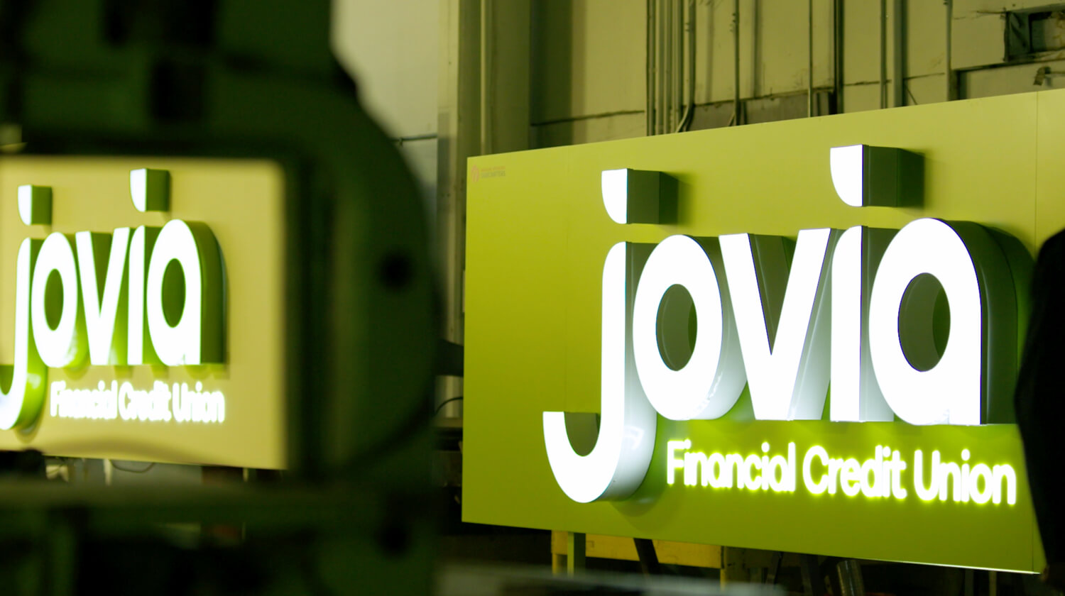
- Logos & Visual Systems
- Video & Brand Animations
- Brand Standards & Guidelines
- Brand-based Marketing Systems
- Environmental Branding
- Naming
- Brand Voice
- Content Strategy
- User Experience
- Website Design
- Way Finding Systems Design
activation
- Employee Engagement
- Sales Engagement
- Advertising
- Launch Planning
- Advertising
- Brand Campaigns
- Internal Programs
- Digital & Website Maintenance
- Signage
- Branch Design
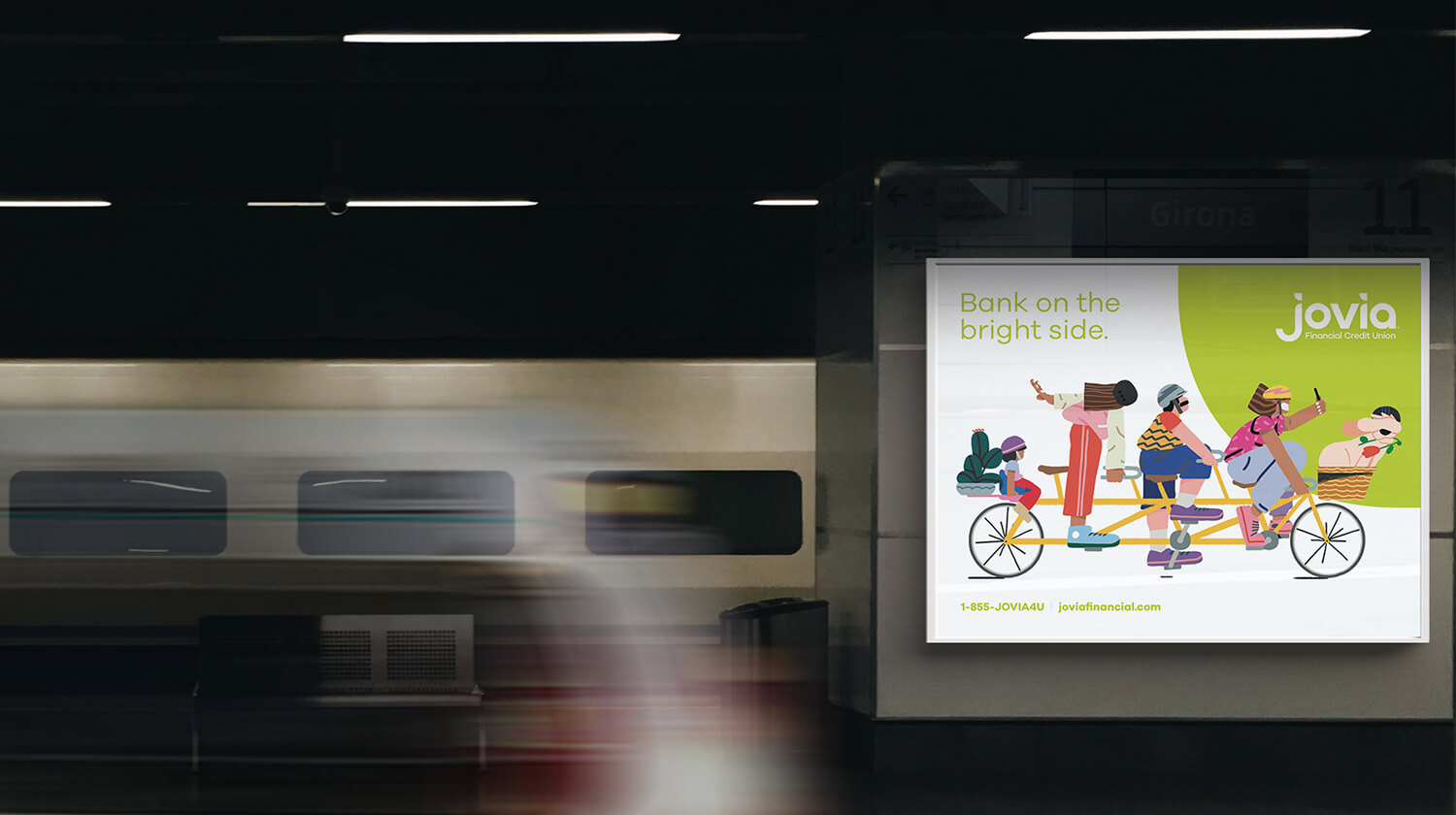
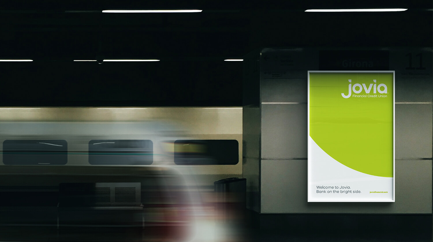
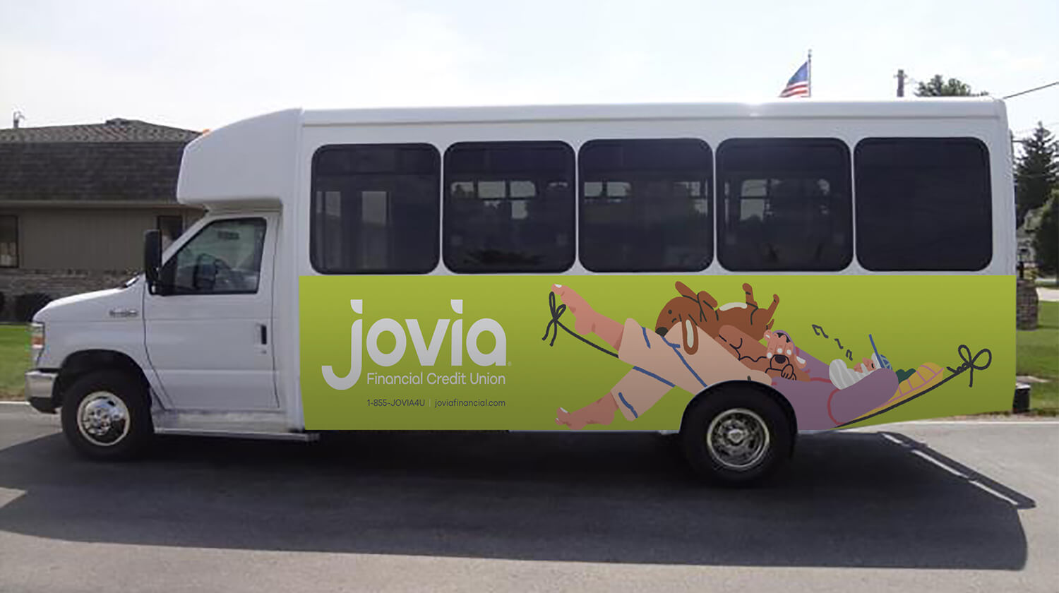
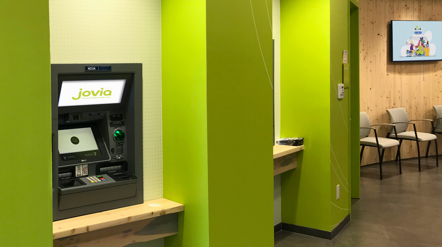
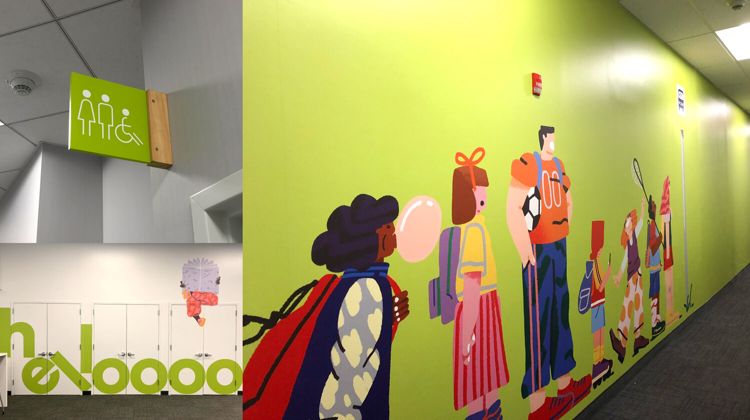
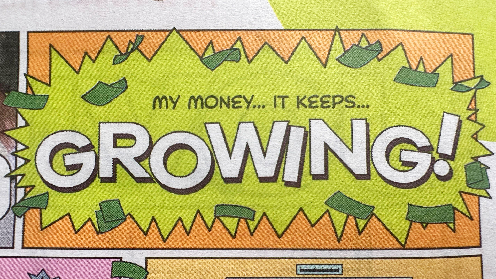
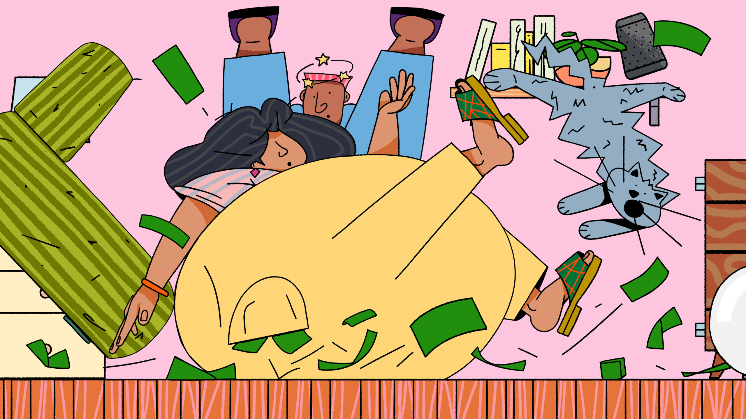
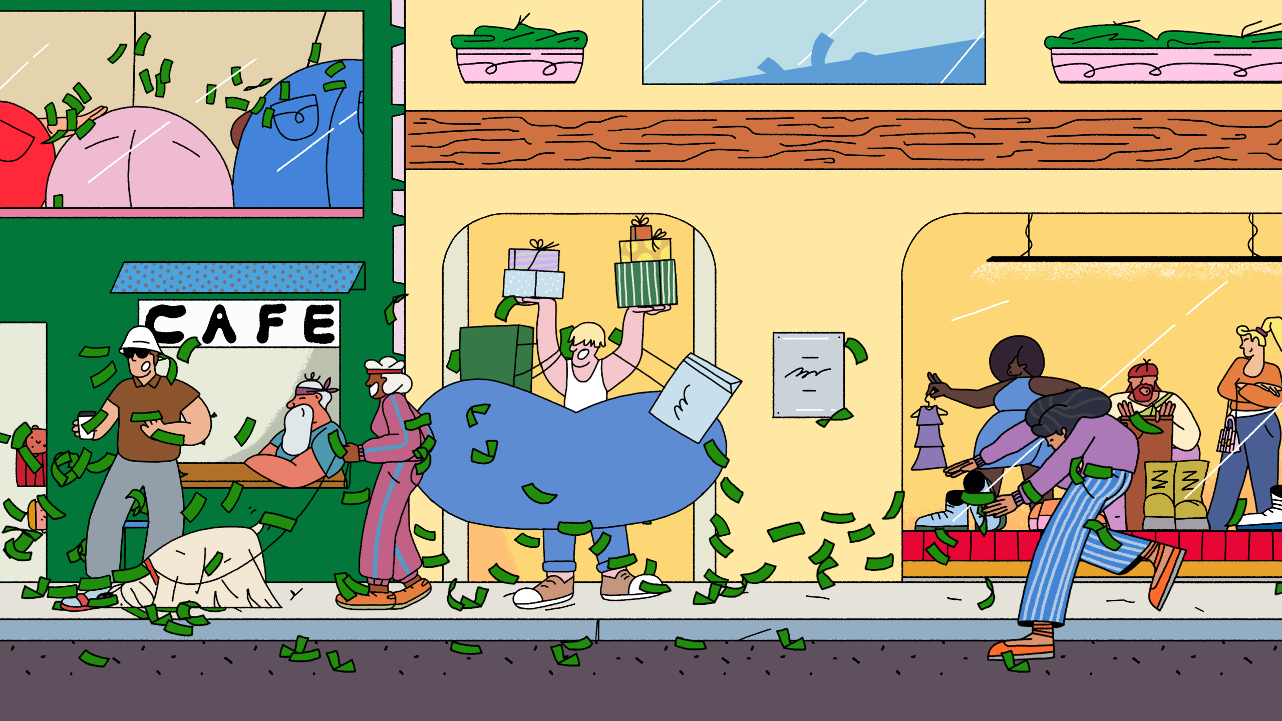
The Jovia brand is about joy and life. It is about living the life you lead the way you wish. The brand library with the Jovia green, real photography, expressive typography, animations and the incredible illustrations by Sebastian Curi create a brand that has power and depth. It is identifiable from the moment you see it, with a complete suite of digital materials to support the brand across all digital and physical engagements.
Although research told us this was exactly the type of work we needed to generate, Jovia took a risk with their TV commercials. Beyond the science, the thing we like most about this approach is that it stands out from the crowd, lacks any pretense and is more human than the staged life scenarios you see throughout the industry. The good news is that the numbers back it up. The response has been incredible.
The Jovia brand is liquid; it was built for the digital age with a complete suite of animations, loops and assets for all forms of outreach. These very assets were also planned for print materials, the branches themselves and sponsored events.


This brand is a reflection of a client that opened their doors and enabled us to gain a deep understanding of their business from top to bottom. This knowledge and depth is a fundamental reason for the success of the Jovia brand. When you understand how all aspects of the business impact one another you can create a brand that helps to weave them all together, creating a brand that is seamless through all experiences.


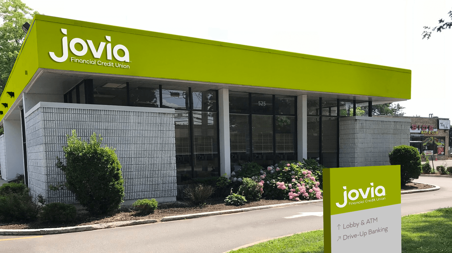
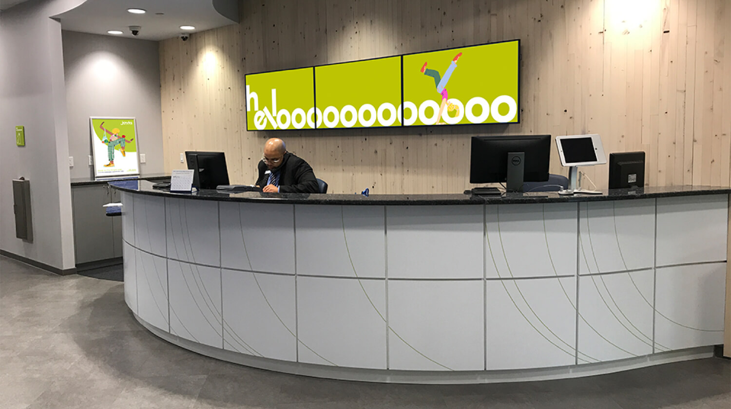
The branches are based on ease of use. As you enter the space you are greeted by a manager at the welcome desk. The walls behind this area are built from reclaimed wood from NYC water towers. The open space is welcoming, customer focused and geared towards communication.
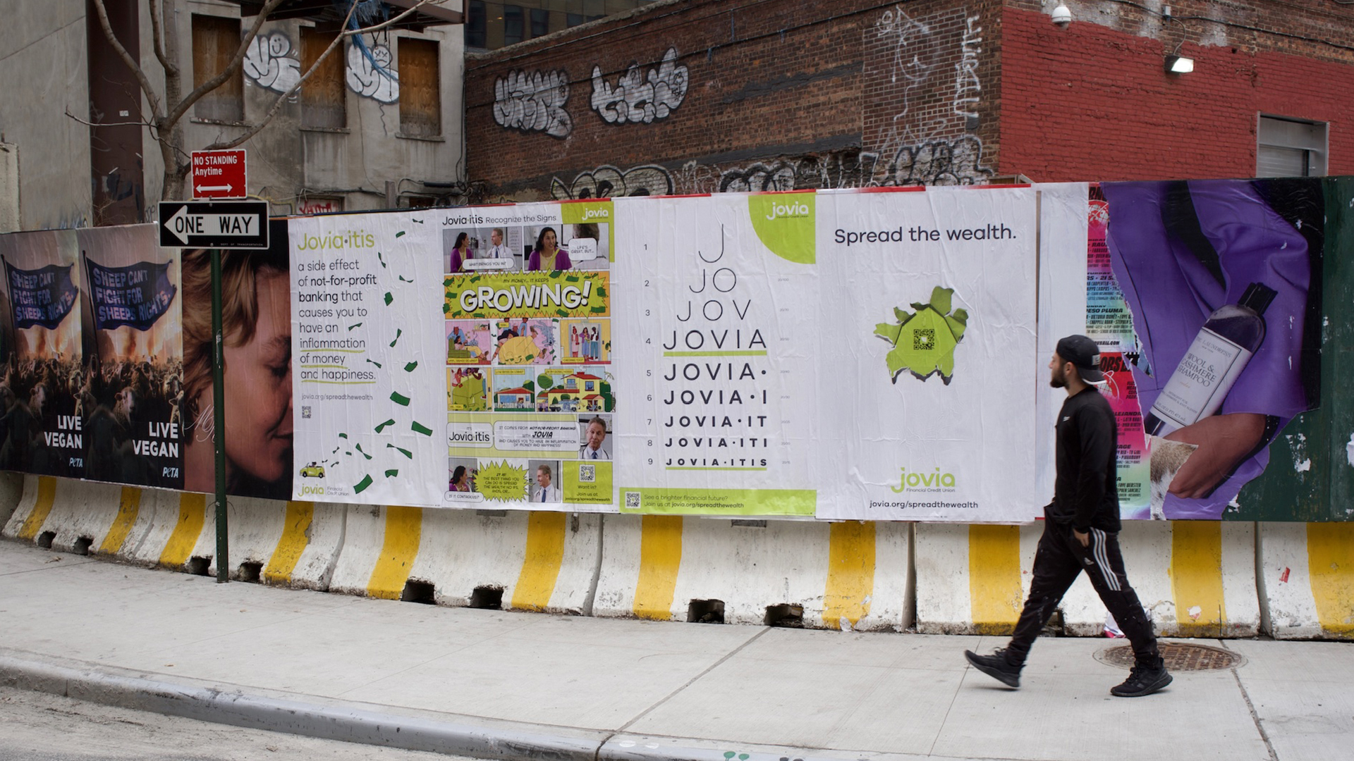
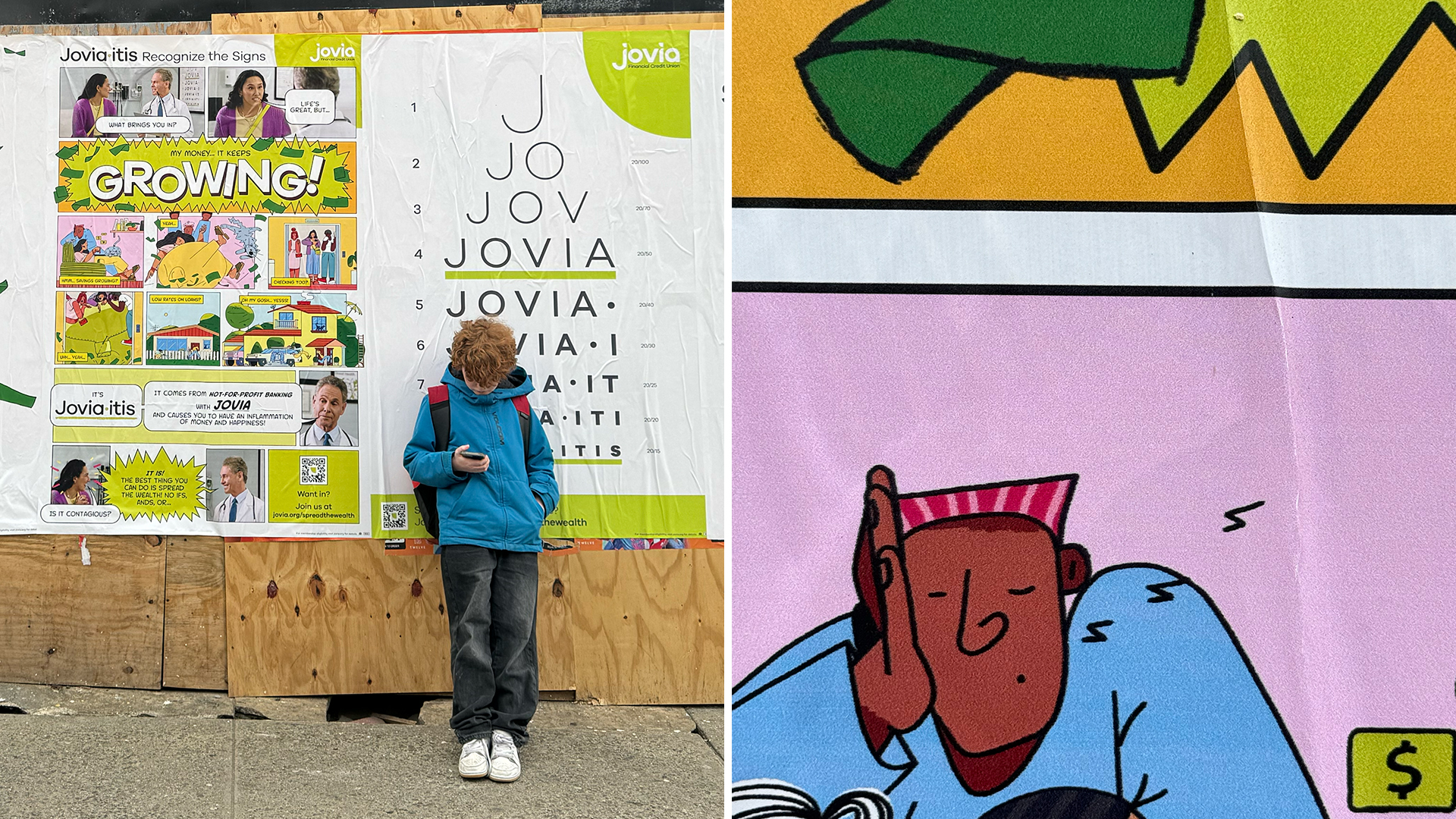
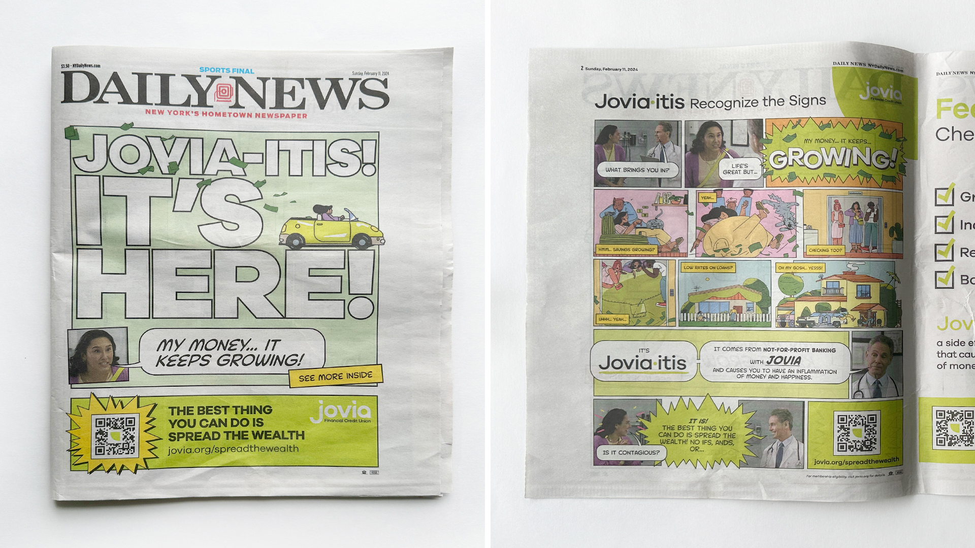
Jovia·itis
Super Bowl Commercials

Challenge
After 80 years of helping people and small businesses with their financial needs, Nassau Educators Federal Credit Union – better known as NEFCU – stood at a crossroads.
The service-based competitive advantage that had enabled the credit union to grow its asset base to $3 billion was slowly being eroded by digital and mobile technologies that are redefining the banking experience. The nature and meaning of personal service and relationships – at the heart of the credit union industry for decades – is being undermined.
NEFCU, a progressive and ambitious Long Island-based credit union, recognized it was time to bravely forge a different path into a new future.
Solution
A comprehensive market and brand assessment was undertaken to assess whether the credit union’s products and engagement model were still aligned with the needs and aspirations of its members. The 5-step transformation methodology included:
- Market orientation: gaining a clear understanding and definition of the future market and the opportunity in it.
- Brand and experience orientation: defining with clarity the promise and the banking experience the credit union needs to deliver to go after the market opportunity uncovered.
- Offering orientation: evolving products and services to align with the brand promise
- Business orientation: evolving the operating model and the technology infrastructure to align with the brand promise and fulfill the intended expectations.
- Culture orientation: evolving the culture to embody the brand promise.
Outcome
An opportunity was identified for NEFCU to reposition itself on a platform of Brighter Banking and recast itself as an organization that helps its members lead life with optimism, convenience and energy. The positioning was articulated through a corporate narrative, messaging platform and a new, fresh brand voice.
The new positioning called for a new name. The credit union has ambitions to expand its service area beyond Nassau County and attract younger members. After a long collaborative process with the executive team and the board, the name “Jovia” was selected. Stemming from the root word jovial, Jovia embodies the optimism, friendliness and energy that the organization wants to be known for.
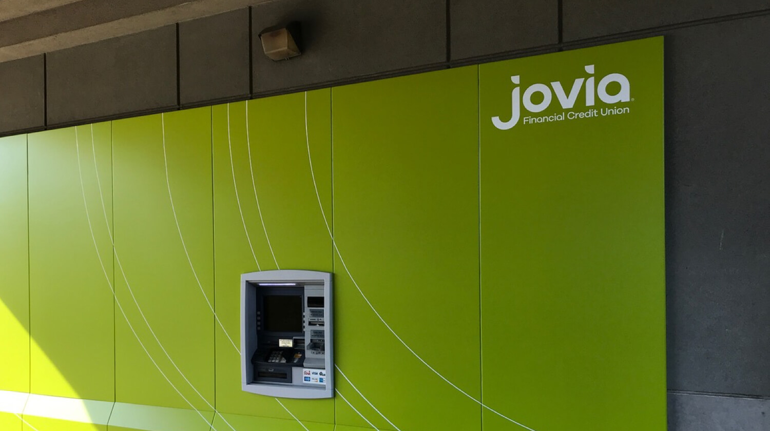
A new, unique and distinctive visual language was developed to break the perceptions of credit unions generally as rigid, conservative and lacking innovation. A bright, distinctive brand color was chosen for Jovia to stand out in crowded mall environments and busy commercial roads. A playful illustration-based language was also created and comprehensively deployed to enhance emotional power and human connection in a competitive field dominated by generic, corporate financial brands.
A complete redesign of the total member experience underpinned and supported the entire brand strategy. It led to simplification of processes and the rethinking of the interaction between members and the organization. The branch experience was also completely redefined to create an optimistic and open environment.
A new, invigorated culture was built on purpose, vision, mission and value statements. All employees were trained prior to the launch to ensure they had both the emotional connection to the brand as well as an intellectual understanding of its intent.
The brand was launched to the market through an integrated communications plan that included TV, radio, digital, out-of-home, cinema, advertising as well as direct marketing.